
The other day I was thinking about how digital marketing programs often get caught-up chasing a...
 Marketing metrics can be highly addictive – there are so many metrics to report on and there’s a natural tendency to want to see them all. However, the reality is too much data tends to leave the viewer confused and can often lead you down the wrong path towards insights. In this article, we’ll take a look at:
- What makes a good dashboard
- Recognizing the difference between a dashboard and a report
- Designing for insights instead of data
- The path to improving your dashboards
- Cleaning out the sink
Making a good dashboard
 An example of a good dashboard sits right in front of many of us every day…just beyond your car’s steering wheel. What makes this dashboard great? It provides the key information you need to check status and make decisions. The most prominent data point is your current rate of speed. You need this information frequently, it needs to be precise (in this example we have both a dial and a digital readout) to the exact mile per hour and it needs to stand out. This data is incredibly important to you as the driver to ensure you’re driving at a speed consistent with others on the road and that you’re aware of it’s relation to the posted speed limit. Whenever you see a police car – you immediately check this number. This dashboard also provides other important information, with much less granular data. The fuel gauge shows we have 3/4’s of a tank – note – there’s very little precision here, no gallons, no ounces, just enough information to let us know whether or not we should start looking for a gas station. We can also see a bright yellow tire pressure light. We know that there are an array of these lights ready to turn on if there’s something we need to pay attention to urgently – but otherwise they are basically unseen.
Another sign that this is a good dashboard is that it’s bringing data together from a variety of different sources…the RPM data comes from the engine, battery charge from the alternator, mileage based on the wheel’s rotations.
And finally, you’ll see that things are well grouped together for the most meaningful data – all of these elements relate specifically to the driver’s information related to their current activity. Where’s the radio?..it’s on a different dashboard nearby!
The difference between a dashboard and a report
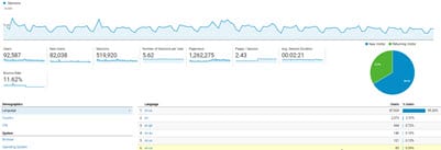
Reports have lots of data and can be incredibly helpful when trying to identify the cause of a trend or an issue. Jumping back to our car dashboard example – the tire pressure light that’s on in the dashboard was caused by one of the 4 sensors in your tires indicating a low pressure state. To fix the problem, you need a report that shows the levels in each tire – and then you simply add air to the tire with low pressure. Wouldn’t it just be easier to have that data on your dashboard all the time? Probably not, because you don’t need that data frequently and it’s easy to resolve. Ok, enough about auto repair…let’s look specifically at digital marketing reports from Google for some good examples. In the most widely used version of Google Analytics (we’ll cover GA4 in a future article) you’ll see an array of reports at your fingertips. In their 4 main categories (Audience | Acquisition | Behavior | Conversions) each section has an “Overview” report that truly is much more like a dashboard than a report.
 On the overview page you see things like trends over time as well some key metrics related to the category and the ability to dive deeper into the reports to look at specific components. According to Google Analytics “Dashboards are a collection of widgets that give you an overview of the reports and metrics you care about most. Dashboards let you monitor many metrics at once, so you can quickly check the health of your accounts or see correlations between different reports.” In most cases, you’ll find you have a need for both dashboards as well as reports – and it’s important to recognize the benefit of each.
One quick check for any metrics you define is to ask yourself – what would I do about a change in this metric? If you don’t have an answer, it probably shouldn’t be on your dashboard.
Designing Dashboards for Insights
Webster’s dictionary defines insight as “the power or act of seeing into a situation”. The key to a truly successful dashboard is to focus on the metrics that you can/want to change, and ensuring that those metrics are front and center with limited distraction. Trends over time (or by market) often provide the best insights to help you improve your marketing activity.
The path to improving your dashboards
The first step is to audit your current dashboards/reports. Is there data you’re missing? Are their items you don’t care about? From there we recommend a brainstorming meeting where you identify a long wish list of success metrics. While you can often start this process with just your marketing team, it’s usually a good idea to engage other stakeholders in the process (sales, c-suite, platform specialists (e.g. social media lead, content developer, etc)). Once you’ve identified the potential list, you’ll need to prioritize the importance of each metric. Consider using the MoSCoW (Must have, Should Have, Could Have and Would Have) rules to help prioritize. For example, you might find there are some metrics that are too time consuming/costly to implement immediately compared to others that may be easy, but don’t offer deep insights). Examples of some of the key components we tend to include in digital marketing dashboards are:
- Session activity – over time
- Goal Activities – leads/online sales, etc.
- Media Spend/Budget
- Cost per Goal
- Channel/Market activity
You may also want to check out our article on the 5 metrics that really matter.
Cleaning out the sink
 A cluttered kitchen sink is just as frustrating as a cluttered dashboard. Data overload is one of the most common tendencies when building a dashboard. With a little planning and prioritization, you’ll find that you can get all the data you need in nicely piled stacks next to the sink – with a clear understanding of what’s important, which order to reach for the information and transform your marketing data into a true business monitoring and management tool.
Considering a dashboard refresh?
Our Dashboard Action Plan will help you get on the right path.
- Phase 1 – Training & Input: Our dashboard action plan starts with an online (or in-person) training session on the fundamentals of dashboard development, an overview of the common tools and basics of integrating and visualizing data from multiple sources. Following the training session there’s an initial brainstorming discussion focused on identifying the most important metrics for your business.
- Phase 2 – Research & Planning: Using the brainstorming discussion as a starting base our team will do an in-depth review of current activity and technical review of your data sources (including web analytics, digital ad platforms, marketing automation/crm, etc) as well as your website infrastructure (platform & CMS)
- Phase 3 – Recommendations & Implementation Plan: In this stage we share the findings of phase 2 and build out recommendations for initial dashboard components and views. We’ll also provide a scope for building out the final dashboard infrastructure (costs vary depending upon tools and integration requirements).
The cost for a Dashboard Action Plan is $6,075 and typically takes 2 – 3 weeks to complete.
If you’re interested in learning more, schedule an initial no-obligation discussion:
"*" indicates required fields